InDesign CS5.5, Export Tagging and ePub export frustrations

7 07 2011

I’ve got one massive gripe with InDesign CS5.5 and it’s ePub exporting. It’s not specifically the ePub export, but also the half-done Export Tags options as well.

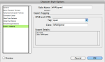
If you’re a CS5.5 user you would have probably noticed that you can specify tag export options for character and paragraph styles. It’s excellent, and is a massive help for producing ePub docs from InDesign.  Especially if you’re writting your own CSS for your ePubs, but once you bring tables and objects in to the document, InDesign drops the ball big time.

The problem

CS5.5’s massive failure is that you can’t seem to add export tagging to table, cell or object styles in InDesign; and what’s worse is that the ePub you export will use a new class name for every table or div (which was an object in your InDesign doc).  This defeats the purpose of adding a class altogether, it’s as if InDesign logic treats adding classes like it does adding IDs (in HTML/CSS, IDs have to be unique whereas classes don’t).

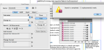
So; for example, in my case I have several docs to my Book; each document has different types and amounts of tables. These tables are for completely different things and I need them styled differently. Even though in InDesign I’ve used totally different table and cell styles, the ePub will append an incremental digit on the end of each class name for each table!!!!

This is what you would expect InDesign to do:

<table id="table-1" class="Basic-Table">
  etc
</table>
<table id="table-2" class="Basic-Table">
  etc
</table>
<table id="table-3" class="Fancy-Table">
  etc
</table>

But instead, it does this: (note the -1 and -2 after the class name… tisk tisk)

<table id="table-1" class="Basic-Table-1">
  etc
</table>
<table id="table-2" class="Basic-Table-2">
  etc
</table>
<table id="table-3" class="Fancy-Table-1">
  etc
</table>

And again, I need to re-iterate, this is only really a problem if you’re attaching your own CSS to the ePub; because when InDesign generates the CSS for you it actually creates ALL THOSE CLASSES, which is pretty stupid really but at least it works.  The shortcoming overall is that you also just can’t do as much unless you really DO write your own CSS for the ePubs, and also, who the hell really wants to have to unpack, edit, and repack their ePubs if they’ve got a workflow of hundreds of books to do? Not me, and not a lot of other people!

A partial fix

So, you can imagine where all this leaves me.  CSS3 can help!  But, again, this is really disappointing, only iBooks on Apple devices will render this properly, if you’re using Adobe Digital Editions or Aldiko eBook reader or anything else on the Android, it doesn’t work.  By using CSS3 you can capture the tables still and apply styles to them like this:

table[class^="Basic-Table"] { styleshere }
table[class^="Fancy-Table"] { styleshere }

No real solution, yet

So, the short of  it is, if you want to style up tables and objects, and have them display correctly on Adobe Digital Editions or Aldiko etc, then you either have to wait for:

  • the eBook reader companies (except Apple who have owned everyone) to get their eBook apps to render CSS3 like the above; or
  • Adobe to release a patch or upgrade to add Export Tagging to tables and objects, which would then let you specify a static class name for tables and divs.
I wonder if either will happen any time soon? I hope so….
If anyone OUT THERE has a solid fix, or ideas to try please comment.


Easily force left alignment in ePubs viewed in iBooks

1 07 2011

Finally! I figured out a much more seamless way to force the headings and any other content to be left aligned in our ePubs for iBooks.  The goal of my ePub creation is really to have a seamless process, we can’t afford the time to unpack, edit html/css, and repack files just for one document… so everything needs to be able to come straight from InDesign and be ready for viewing in iBooks.

I’m also assuming that a large proportion of users probably don’t even know how to turn off the full justification setting for iBooks.. I mean, I didn’t realise the options were in the settings on the iPad for a LONG time myself.. So, by forcing the left align on the headings at least the ePub will look and read nicer with the justification setting still turned on.

The only solution I saw on the net to solve the left-aligned problem was to edit the html of the unpacked ePub (which is a massive no for our workflow) and add a span element inside the heading tags. It got me thinking though, and the idea suddenly came to me.  Get InDesign to just do it for you.

First off, create a new character style in your master document (the one that synchronises styles between all the docs in your InDesign book). Call it something like leftAligned. Go to the bottom option, tag formatting, set it up so a is added with the class of leftAligned.  Now, in your css file (the one you use when you export your ePub files) you can have a class that looks something like:

span[class*="leftAligned"]{ text-align: left; }

* little note; just found out the span doesn’t even need to have any styles at all, oh well!

Now, to use the character style and get InDesign to do the work for you; do a find and replace for every document in your book; and what I did was search for any H1 paragraph styles, and have it apply the leftAligned character style to them. I then did it with every other heading type and the referencing paragraph styles.

When I exported to ePub and viewed in iBooks, FINALLY I saw left-aligned headings. MUCH nicer, and much easier than unpacking, editing, and repacking the ePub.


Making my moodle themes a little bit smarter

20 06 2011

When I was little, I was an avid commodore 64 player.. eventually we got a 286, then 386, 486, pentium, etc and so on.. Now we’re walking around with awesome tablets like the iPad2 and so on, its staggering to think of the progress.  ..and after using computers for almost all of my life, I’ve really been noticing in the last 5 years that something new is actually starting to happen.

Simplicity. Intuitive design. Computers and all the user interfaces are finally starting to take away the dirty layers between our minds and what’s happening in the screen.  For instance, I’m finding more and more that before I even get to think “how do I do this?” (when using a tablet/website) I’ve actually already done it by accident (well, by intuition actually) – is it the computers, UI, and software changes, or is it actually ME that has changed, or both?  Probably both, but nonetheless its bloody amazing.

With my UI & web design I’m trying to make the effort in the design/development phase to reflect all this. Mostly this has just involved basics like not having save buttons in web apps (auto saves with ajax etc); loading content in to pages without needing to refresh the whole site; and pseudo intelligent UIs that change the layout of the site for different devices. The stuff that removes some of the thinking or burdens from the user.  Anyway, I thought how I could apply this to Moodle.

Making my themes play nice with mobile devices:

Naturally I thought of updating my moodle theme designs to better cater for mobile viewing.  Now I say “better cater for”, because this is somewhat of a half way improvement, not the ultimate solution (which would probably be a native app).  I know people out there are doing big stuff for mobile moodle and mobile friendly moodle themes etc; but rather then going all out and desiging a completely new theme OR trying to change the way moodle works; I’ve simply written some YUI (the default Moodle scripting library) to change the interface on the fly if the user is on a mobile device/tablet (things like iPhones, iPads, Androids etc).  Yep, so the user experience is the same on a desktop, laptop and mobile, but the display format just changes to suite the smaller device better.

Basically I wanted to get RID of how tiny everything is when viewed on such small screens but still have be able to use the nice looking theme, and I’d hate to think that some Universities might even run two themes (one for desktop/laptop computers and another which looks different for mobiles).

What I hope to achieve here, is to have the nice looking theme like Université, but also give it some pseudo intelligence so that it completely changes the layout for small screen devices – to make the content more readable straight away, and eliminate the annoying need to constantly zoom in and out to do stuff when using Moodle on a mobile. It basically just re-collates the page structure and collects all the blocks and puts them in one column.

I haven’t finished testing this yet, or tweaking it either, but it looks like a fairly good idea; it only took an hour or so to add this to my moodle 1.9x theme, here’s some screenshots..  Once I get it working really nicely I’ll roll it out for Université and maybe Créatif too.  Its a small amount of effort which hopefully translates in to making the UI a little better for mobiles etc.

What do you think?

(had to take screenshots with a squashed up browser because the Android 2.1 samsung galaxy S is so crap it won’t take screenshots. hah.)


ePubs from InDesign, workflow and problems

14 12 2010

This week I’m aiming to get an ePub format of the University study guides in working order. So far it’s been VERY surprising how difficult it is to take even a fairly simple previously-print-based document and export it to the ePub format whilst still making sure it looks nice and is bug-free.

The study guides are InDesign documents, and I’ve heard/read good comments regarding ePub support and so on. But so far, I really have been un-impressed.. annoyed more often than not actually.

Naturally then, this post specifically relates to creating ePubs from InDesign and the associated problems.

Read the rest of this entry »


A moodle 2 theme, Université

3 12 2010

I’ve been looking at Moodle 2 again, at my day job, trying to make little enhancements and seeing what’s possible for our own Moodle installation. Part of my experimentation included making a theme design that the University might be able to use when they roll over to Moodle 2.

As a spin off, I decided to split the design in to two copies; one that I’ll continue to work on for my employer, and one available for community download right now, at the current state of the theme.

I hope you like it. It’s called Université.

** News: Just about to release an update on this theme for Moodle 2.1, see the Moodle Themes page for more details **

The general aim of the theme, is to have a nice slightly corporate looking theme, which is fairly easy to completely change the colour scheme of, so that the administrator can more easily make it fit with their own institution’s corp id.

A screenshot of the new theme design

So, how do you go about changing the colour scheme to match your own institution?  You’ll need to do two things, start by designing a new theme with JQuery’s Theme Roller application (mentioned below); then, use matching colours and the Université’s own settings area to customise the colours of the banner, headings, and hyperlinks (the stuff that the Theme Roller css and images won’t do).

JQuery Theme Roller.

Now, this lovely online tool will let you design awesome looking user interfaces, it’ll give you a stack of images and css all ready to go.  The cool thing is, the Université theme for Moodle 2 uses the theme-roller CSS and image directory in a way that lets the administrator:

  • Roll out their own UI design and paste it over the Université theme jquery-ui.css file and jquery-ui images directory.

Now, yes, it sounds easy. Well, it is easy, but there needs to be an extra step because of the way Moodle 2 handles images in CSS.  Basically here’s what to do once you replace the CSS.  Open your new one, and do a find and replace:

  1. search for ‘images/’
  2. replace all with ‘[[pix:theme|jquery-ui/’
  3. search for ‘.png’
  4. replace all with ‘]]’

Then, almost the entire interface will change appearance. Nice hey. But eh, there’s a couple of areas that the theme roller didn’t apply to, so, that leads me to the second enhancement in the theme;

Keep in mind though, that the colours should be as dark/light as they are in the default theme I’ve created, simply change the hue if you want to roll out a new theme-roller to avoid any issues with illegible text etc (dark text on a dark block header for example).

The theme design in Theme-Roller

The Université theme’s settings page.

On the settings page built in to the Moodle theme, you can change the colours of:

  • The links
  • The link roll over colour
  • Link colour in the header
  • The two colours that actually make the gradient in the header
  • and the colour of the buttons in your dock (dock titles), which I couldn’t get the theme to handle automatically.

So, there you have it.

If you’re wondering how the Moodle theme uses the JQuery theme roller files, then read on..

Javascript.

Basically, the theme javascript file does all the work. Yeah, I dunno if it’s the best approach, well okay it’s not, but it certainly works well enough. The javascript (YUI3) find all the elements that are relevant – such as block headers, forum headers, the calendars and so on), and simply ADD the JQuery UI theme classes to those elements once the DOM has loaded.

This is what allows the JQuery Theme Roller css to be almost drag and drop with the Moodle theme.

A little more customisation?

You can actually give some Blocks a slightly more important look.. for example, say you wanted your course list block, and some other block to have a slightly different coloured header, to make them stand out. You can do this by editing the javascript file in the theme’s javascript directory.

To do this, just go in to the JS file, and you’ll see I’ve got about 4 lines commented out as an example, lines 38 to 42, commented with “important blocks”.  Just uncomment a line, and use the html class name of the block you want to make different in appearance.  It simply applies a different class to those elements, and hence makes them look different.

Oops, almost forgot.

As with before, thanks to the JQuery theme roller, aaaaaand Mark Jame’s awesome icons called Silk.

Thanks also to Reuben and Tobias for mega help with testing and finding bugs for me to fix with my last theme, I used all the same fixes so far on this theme too!

And, like my last theme, just update the logo with your own institution’s logo, by replacing the logo.png file in the pix directory. Note the size of that area though, there’s not much space there! (and did you like how it fades in?)

One other thing; I didn’t really spend any time on the main menu feature, so if you use a main menu with your site I’m sorry in advance, it looks pretty crappy in my theme.. I’ll get to fixing it up at some point : D

Wanna download it?

Suss out the Moodle Themes page of this site to get the download link and any latest news on this theme.

Feedback?

Sure, leave a comment, I probably won’t have time to make any fixes until next year, but your comments are most welcome!


créatif (ver 1) – a theme for Moodle 2

6 07 2010

PLEASE NOTE: I’ve just updated the download files again, Nov 30th. It should work with Moodle 2’s official stable release, which was downloadable from the 24th Nov from Moodle.org. There may be some further glitches that I haven’t seen, so please feel free to leave a comment if so.

I’ve just designed a theme for Moodle 2, and I’m entering it in to a theme comp ran by New School Learning. Pretty exciting really, the process of making the theme was really fun, except the bugs in IE of course, haha!

My theme, called créatif, is a mood theme I reckon. The randomised back drops will feature faded photographs (mostly beautiful landscapes), and I’m trying to get a really nice pleasant visual experience happening.

Technically the first draft is fairly okay – I would have liked to have made use of renderers to completely overhaul a lot of the un-needed html and css classes that moodle is bogged down by, but time permitted me from doing it for this version of the theme.

I think the big thing to improve next version (ver 2) of this theme, along with renderers and more effective css will be:

  1. to allow teachers to add their own imagery for the backgrounds for ‘their courses’ – pictures that are course specific for them for example. It would use these instead of the pre-packaged ones I’ve got in the pix directory;
  2. I’d also like to make it work 100% drag-and-drop with jQuery’s theme roller.. So in other words, you simply design your jQuery theme roller and drop it in to the moodle theme directory – and the moodle ui takes on the jQuery css and pix. Why? Well let’s be honest, YUI looks like horrible in comparison and jQuery’s theme roller idea leaves YUI skinning for dead;
  3. have a rather nice handy settings page which allows the admin to change the logo and/or background images, and theme roller css via the GUI rather than putting the files in manually etc;
  4. I might also make it a stand-alone theme rather than use other themes as parents, I only did this to satisfy the requirements of the comp.

Without further adieu, je vouz present – créatif; screenies and a theme download. IF YOU DO DOWNLOAD and install this theme, please read the comments in the config.php – I’ve described a few things that will help you update the institution logo and background images.

This slideshow requires JavaScript.

The download: visit the Moodle Themes page on this blog ; )


Can’t get jQuery sortable to drop on to empty lists?

18 05 2010

Well, I had this little problem today, and I also noticed that there were a lot of other people out there that didn’t understand why it was happening. Which is why I decided I should post the solution.

The jQuery demo on sortable connected lists

The problem of not being able to drag elements in to empty lists, only occurs when the empty list doesn’t have any dimensions… Okay, that sounds confusing. Take my example.

If I have a list, and the list element’s padding and margin have been set to 0px with css – try to view the list element’s area on the screen using a tool like firebug, you’ll notice that it basically isn’t there.

So, technically, the drag and drop between the lists doesn’t work because there’s no longer (or never was if the list is initially empty) any element to drop the new child element IN to.

The solution? Well of course, just add some padding in the css to your UL or OL, and you’ll see that it has some substance regardless of whether it has child list items or not. You’ll then be able to drag in to the empty list perfectly.

Another solution, which might not be as reliable but it’s still good, is to have a min-height css attribute for that list element, so regardless of your lists’s number of list items, it has a certain element height at all times.

Easy peasy. I’ll bet the same solution can be used for Scriptaculous and other scripting technologies.


Repurposing XML statistics for InDesign automation

22 03 2010

Well! I’ve been working on a lovely statistics prototype. Using the latest jQuery, theme rolled to match my employer’s corp ID, and the awesome free trial of Fusion Charts (along with a bit of php and xsl mastery), I’ve made a pretty cool stats prototype website.

All the graphs OR table views are rendered from XML files containing the institution’s statistics, both views support clickable drill downs and the whole interface is slick as, but it stops at on-screen graph/table viewing.. Even though the UI is rich and fun to use (accordion, nice jQuery forms and tabs), I’d like to make it a little more fancy than that. In comes InDesign.

Screenshot of the online statistics prototype I was working on

I don’t have a copy of InDesign server, and I’d love some training in scripting and InDesign server apps, but for the moment I’m working on a scenario with the InDesign CS4 client – here’s what I want to do.

I want a button on the prototype site that says “send me these stats”.. from the user’s perspective, they click it and next thing, an email shows up in their inbox with an attached PDF of beautifully formatted statistics, with the institution’s logo and so on. Sound nice?

From my perspective that means: I’d need the XSL for InDesign to transform the XML used by Fusion Charts and the prototypes XSL (in table view) – which would allow InDesign to import the data as an actual table, already mapped with table and cell styles. Obviously to automate all this and generate/email a final PDF I’d need the InDesign server, but hey, I’m just trying to prove a concept here that it’s doable.

It’s quite easy to import XML in to InDesign and have it all mapped with styles and automatic formatting. Take my XML for example:

<chart caption='Student Load (EFTSL) by Gender' subcaption='2006 Full Year' xaxisname='Student Modes' yaxisname='Student Load' palette='1'>
	<categories>
		<category label='Commencing' />
		<category label='Continuing' />
		<category label='All' />
	</categories>
	<dataset SeriesName='Male'>
		<set value='4275' />
		<set value='6245' />
		<set value='10520' />
	</dataset>
	<dataset SeriesName='Female'>
		<set value='3401' />
		<set value='4532' />
		<set value='7933' />
	</dataset>
	<dataset SeriesName='Both'>
		<set value='7676' />
		<set value='10777' />
		<set value='18453' />
	</dataset>
</chart>

And look at how I’ve done the XSL for InDesign, note the name space defs, in particular the aid5 one which is for the latest version of InDesign only ; )

<?xml version="1.0" encoding="UTF-8"?>
<xsl:stylesheet version="2.0" xmlns:xsl="http://www.w3.org/1999/XSL/Transform" xmlns:aid="http://ns.adobe.com/AdobeInDesign/4.0/" xmlns:aid5="http://ns.adobe.com/AdobeInDesign/5.0/">
<xsl:template match="/">
<xsl:for-each select="chart">
<Root>
<Story>
<h3 aid:pstyle="h3"><xsl:value-of select="@caption"></xsl:value-of></h3>
<h4 aid:pstyle="h4"><xsl:value-of select="@subcaption"></xsl:value-of></h4>

<Table aid:table="table" aid:trows="4" aid:tcols="4" aid5:tablestyle="DataTable">

	<ColHeader aid5:cellstyle="BlankCell" aid:table="cell" aid:theader="" aid:crows="1" aid:ccols="1" > </ColHeader>

	<xsl:for-each select="categories/category">
		<ColHeader aid5:cellstyle="ColHeader" aid:table="cell" aid:theader="" aid:crows="1" aid:ccols="1" aid:pstyle="TableHeading"><xsl:value-of select="@label"></xsl:value-of></ColHeader>
	</xsl:for-each>

	<xsl:for-each select="dataset">

	<RowHeader aid5:cellstyle="RowHeader" aid:table="cell" aid:crows="1" aid:ccols="1" aid:pstyle="RowHeading">
		<xsl:value-of select="@SeriesName"></xsl:value-of>
	</RowHeader>

	<xsl:for-each select="set">    	
		<Cell aid5:cellstyle="TableBody" aid:table="cell" aid:crows="1" aid:ccols="1" aid:pstyle="TableText">
			<xsl:value-of select="@value"></xsl:value-of>
		</Cell>
	</xsl:for-each>

	</xsl:for-each>

</Table>
</Story>
</Root>
</xsl:for-each>
</xsl:template>
</xsl:stylesheet>

To get it in to InDesign, it’s quick as, you just import the XML using the above XSL file, easy peasy, and because the XSL transforms the XML in to a format InDesign ‘likes’, the table will be created properly.

Problems are always involved though. So far I haven’t solved these:

  • I had to set the table’s cols and rows manually in the XSL – this is totally not good. You can do all sorts of tricky things with XSL 2.0, so, I’m sure I could put the count of the desired nodes in to a variable and base the column and row count on that.
  • Look at how it comes in to InDesign – the table width!!! Or should I say LACK of table width. I want it to full width the table but I can’t set any static dimensions because the number of columns in tables will always be variable… what to do I’m not quite sure. I could probably create an InDesign script which makes the table the width of the page (within the margins) then distributes the columns evenly? Then again, I could also do some trickery and math in the XSL – count the columns, divide the page width by the number of columns and use the standard cell width in XSL?

Still, it does look promising nonetheless. I’ve seen lots of posts on the net with people having problems getting table data in to InDesign at all, so hopefully the above code snippets and stuff will help some people.

I’ll keep working on this though, and at some point, I’d LOVE to get my mittens on a copy of InDesign server to see what it can do to help me.


The stats of success

23 02 2010

Some time ago I posted about the eStudyGuide website I set up to match our InDesign study guide process. To explain it again, briefly, the XML from our InDesign TOCs get’s uploaded to a webserver along with the PDFs – the webpage reads the XML files and renders a download page for the course you’re looking for.

Well!  Anyway!  Term has started finally and this is the first semester that I’ve had the pages also hooked in to Google Analytics. I had this weird moment of doubt at some point, that the eStudyGuides weren’t really being used, and that we’d not really contributed anything of use to the University.  Not sure why on earth I thought that.  The stats for the first couple of weeks of Term prove how useful it is.

  • Over 4000 page views already
  • Over 1300 hits already
  • Over 5.5 minutes average on each page


eStudyGuide stats

I love Google Analytics, it’s damn awesome.  I’m looking forward to seeing the trends from now on, how each term differs from the next.

Overall, the InDesign XML features have really proved essential in all of this.  There are some glitches though that I believe I’ve never mentioned.  Some times carriage returns get tagged in the TOC when you map styles to tags – which means you get an empty XML tag in your XML document.

You’ll need error checking to make sure you’re not rendering that empty tag as anything on your website, especially if the count of XML tags matches a document count like the eStudyGuide set up.

I wonder though, would it be worth doing an XML Schema and having InDesign validate it’s output with the schema when we export our TOC XML?

The whole process, exporting the XML and PDFs, and then uploading the files is a bit labourious too, and mistakes happen.  With a bit of perl/php mastery, one of the more technical sauvy guys in our team has done some brilliant reporting around the setup, as well as a script that handles that uploading – a must have.  It checks document counts with the XML tags to make sure they match, checks for typos even, missing files, and more.  Many thanks to Damo for his help.

Onwards and upwards, I wonder what the next lot of improvements to the eSGs could be 🙂


Putting statistics online

4 02 2010

We have a statistics website at work with an enormous amount of statistics available for PDF download.  I like PDF downloads.  But.  Just to get a table of statistics, a user has to click through 5 layers of navigation!  The menu, sub menu, sub sub menu, sub sub sub menu…. you see?  It’s not really ideal – all that just to get a downloadable PDF, which usually opens up in an annoying new window as well.

The sub menu navigation on the site is basically like choosing a statistics category, and graph metrics.  So, I figure it’s got to be cleaner if we move to some sort of online graphing tool, right?  We could have a single page even, where a form (or cascading forms) refresh the graph and it’s metrics as you click.  All in one spot, tidy and neat, and fun.  It’d also be easy to have a tab for table-view for people who don’t like graphs.

There’s a lot of problems to overcome before I can start though.  I wrote a report for my boss, just to itemise what we’d need to consider, to move to online graphing.  The stuff below is a part of the report.  If anyone out there has any wonderful ideas about the best way to go, please let me know.  I’m mostly interested in how to get the data in to XML (from excel) in an automated way; and how to conceptualise heavily layered statistics in to graphical break downs.  Is all this a good idea?

As a start I actually did a tiny prototype using the free tool SWF/XML Charts.  It’s a good tool, easy to use, looks reasonable to the eyes – and most of all it was easy to flex in to something more powerful, with a bit of php, ajax and jquery.  I had it set up to work really well – the forms refreshed the graph on the fly; the table view read the same XML file as the Flash graphing tool, and transformed it in to a HTML table (in the table tab).  It was so dynamic and I loved it as a basic prototype – but I’m just not sure of the best next step yet.

Example graphing prototype

It worked really well - there was one tricky part though, the tabs loaded content with jquery ajax and if you changed the forms whilst in table view (for example) the graph view didn't refresh because it didn't exist. Luckily it was fairly straight forward to fix with some callback methods in the ajax call.

Oh, and another tip – the tool hated having symbols parsed in the URL for the xml data source. So my ajax table loading might be like this:  (all these variables are actually values from the form, and the events are triggered by changing the form)
$("#Table").load("tableContent.php?data=TrendData_MainIntake" + "&graph=" + graph + "&category=" + category);

But the url variable in the script that loaded the flash graphing tool had to be like this, using hex values in the path:
url = "graphContent.php%3Fdata%3DTrendData_MainIntake" + "%26graph%3D" + graph + "%26category%3D" + category + "%26type%3D" + type;

It’s fun getting all this stuff to work. I hope it turns in to an excellent project, a small part of my report is as follows if you’re interested.
Read the rest of this entry »